Leveraging Sunk Cost Fallacy in Design to maximize User Retention
Days Sober. 2024
Days Sober is a sobriety tracker that aims to help victims of addictions navigate their sobriety journey successfully. By encouraging consistent engagement with key features, Days Sober creates a psychological investment that reinforces users' commitment to their sobriety journey.
CONTEXT
It wouldn't be the first attempt
Sobriety management apps are everywhere—from niche ones that claim to keep users away from one particular addiction type, such as pornography or substance abuse, to similar ones like Days Sober, which covers a range of addiction types. However, many of these platforms utilize streaks, more specifically, the winning of streaks, to keep users going, and rightly so—it works—until it doesn't. Let's break it down.
69
days
sober
THE PROBLEM
In the context of addiction, using streaks to maintain your sobriety count sounds like a good idea; after all, that's all an addict does: maintain a streak of sobriety, only without the app. And by the nature of the term, once you lose a streak, it resets, and then you start afresh. As mentioned earlier, virtually all sobriety apps employ and enforce this feature, if you can call it that.
A new coat of paint
Because of the acquisition, the whole platform was getting a facelift, and this might throw off regular users. We had to make the changes as familiar as possible.
More and more
Re: Acquisition, a good number of features are being added to the platform, which would be referenced in the onboarding. There are already a lot of forms in the current version, so it was easy to see how this might make things a bit difficult.
Comfortable loop
A good portion of our customers were letting agents who, as expected, would spend a lot of time onboarding a ton (hopefully) of potential tenants on the platform. This meant coming back to the onboarding repeatedly to do the same thing over and over again. This, combined with the increase in features might complicate the loop.
A new coat of paint
We had about 12 weeks to get this done, which considering the fact that we might just be testing the design system and making changes to that as we go along, might not be enough time at all. Additionally, the end of the development timeline (outside of the 12 weeks) coincided with the start of school year, September, which meant an influx of tenants - student tenants, so it was quite paramount that we got it all set up and ready to use by then.
THE CHALLENGE
Redesign and (hopefully)improve the onboarding journey, adding and removing the needed features, and provide a much more intuitive experience, while keeping a familiar look... in about 3 months.
week 1
week 2
week 3
week 4
week 5
week 6
week 7
week 8
week 9
week 10
week 11
week 12
Synthesize texting
Constraints & considerations
Rapid ideation & prototyping
Constraints and considerations
Visual design and direction
Component library, high fidelity, design execution.
Test. Refine. Launch
Edge cases, finishing touches, documentation.
Proposed design timeline
FORMS. FORMS. FORMS
We need to make the sheer number of forms less overbearing.
With features like bill splitting, power usage selection, rent inclusion etc, added to the offered services, the number of inputs required on single or multiple runs were a lot, even if we pre-filled some of the redundant information. We needed to find a way make users unaware of that fact.
We looked to inspirations like Airbnb and Wise, for their cleaner approach to onboarding.


Onboarding Inspiration
But it wasn't the same!
While it would've been nice to solve our problem this way, it spawned two new problems to solve if we were going to keep the pages "clean".
Our onboarding had a summary section that HAD to be there so users could see how much they had to pay at every step of the process.
This looked NOTHING like our existing platform.
Reducing the number of forms on page would mean increasing the number of PAGES… so it quickly became the devil and the deep blue sea type of thing.

A section from the old onboarding
So how do we solve the summary problem, you ask?
We explored a number of options including getting rid of the summary which was a fun laugh because we knew how disastrous that would've been.
We went with relocating the redesigned summary widget from the right side to the bottom, which would leave the top part of the page clean as intended, and the bottom less intrusive yet accessible.
Old
New (proposed)
Summary relocation
Great, so what about the number of forms?
How do we make the user unaware that they're filling in a lot of forms? So we thought, what if we shared the workload and helped the tenants fill out some of the forms via the letting agent?
At that point, the letting agent side of things was pretty barebones, compared to the tenants'. Most of what they had to do was register tenant names, and some light details, and send the tenant an invite link to fill in the bulk of information.
This way, tenants, who already have a lot of information to fill in, aren't burdened by some of these forms and might spend less time during onboarding. The thing is, however, that they still needed to see these bits of information for confirmation, in case of errors or misnomers.
Having some information pre-filled and located where the summary would be (you don't get the summary till you have added your bills) reduces the number of active forms on screen. We are able to add the extra features on some extra pages without needing to sacrifice the minimal approach we're going for.
We spoke to engineering on how feasible this would be In terms of data persistence - letting both sides of the coin have access to the same bits of information and they ensure that it wouldn't be a problem.
Old
New
How form division works
And the user drop-off point?
A lot of user drop off, about 54% of it, happened at the "invite bill-payers" stage. Inviting the bill payers meant entering the details of those with whom the bills will be split. Nothing was particularly wrong with this page structure, except that you couldn't skip the page.
It turned out that a lot of the time, users found it inconvenient to enter their prospective housemates' details because they might not be available at the time of onboarding.
So what if we made it skippable?
Old
New (proposed)
Some in-house feedback
It was much cleaner, as intended with the design direction and provided more focus
It looked nothing like the current platform, We couldn't compromise on that.
How was the plan working out so far?
Well, let's begin with structure.
A standard set of layout grids defined by desktop-based breakpoints, was critical in ensuring the team could design and build with velocity and consistency.
Mobile
Tablet
Web
Layout grids
It's not done, but does it taste good?
With Framer, and some code, we were able to prototype what we had designed for testing, and make user data persistent as they progressed. There were some limitations, but this was a much faster way to test the ideas than going straight to development.
We went with an attempt at amplifying the perception of progression, further mitigating distractions by making readability simpler— placing high emphasis on the forms you're about to fill.
Basically, we made the forms the primary element on screen.
To be objective about the new direction, we decided to test with a curated selection of users who had never used the platform.

Getting started v2
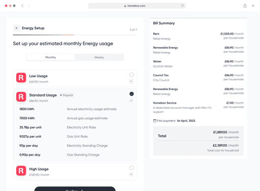
One of the features added was the ability to determine if you wanted to add rent to what you needed Homebox to handle. This would determine the structure of the pages to follow.
Account setup
One of the features added was the ability to determine if you wanted to add rent to what you needed Homebox to handle. This would determine the structure of the pages to follow.
Rent setup
There are certain sections pre-filled based on whatever the letting agent had entered are placed blow the CTA, making sure that you can see it without being hindered by it, and you can also edit it if the information proved to be incorrect.
Bill setup
We also used the new "under the CTA structure for any extra information that we would not want to distract you with.
Bill payer setup
The acclaimed summary section that plagued us for a while is displayed under the CTA, visible, accessible and out of your way.
DESIGN CONUNDRUM
The big problem - It was too different!
For the most part, this approach was simple and kept the ball rolling with the new test users. Testing had users spending an average of 7 minutes during onboarding, compared to the 10-14 minutes spent on the old version.
So, we decided to open it up to the main test group—this time, to users already familiar with the platform: the letting agents and selected tenants. (We promised them coupons for participation.)
It didn't test well for a plethora of reasons.
Even though having the letting agents enter some more information was optional, they didn't appreciate having to enter those details. They quite preferred how things worked before.
This was new—too new—for them. It was too different from what they'd known and trusted all these years. It wasn't that it was bad; as far as they could tell, it was just different—too different.
These were serious issues because we needed the platform to be fluid in time for student resumption. So the question remained… "How do we maintain our improvements while staying true to what the users already know and love?" At this point, we were already close to the deadline we had set, and engineering was ready for the handoff.
"Is there way we can use the old version when we need to, while we learn the ropes with this one?"
"I don't know about this one. Is this the new approach now?"
"Also, what are these new options? Why do I gotta be the one to enter them?"
"Adding bills is confusing. It takes me a while to understand what these small buttons do."
"I'm really confused about this design. The first one worked just fine"
Feedback and Insights
The rollback
We went back and forth with this problem, as we had seen that, objectively, the new direction wasn't bad. However, while new users were obviously very important to company growth, it was most essential that we kept our current user base happy.
We hypothesised that we'd fed them a little too much at once.
We needed to ease users into the new direction and features, so to do that, we applied the new design system to the old structure and called this the v1.
This came with all the functional improvements earlier mentioned—even the part about letting agents having to enter some extra information, because this was important to the company merge.
Old
New
How form division works
How did this approach go?
About as well as we'd expected. The new features were rather self explanatory, and with most of the issues raised during the earlier version of feedback solved, it went better with test users. Some of the issues raised included:
Because of the new features, and the new structure, users then had a lot of forms to fill. But this was a necessary evil.
Some preferred the previous version because if seemed shorter. This however couldn't have been avoided because of the addition of the new features. Also, necessary evil.
A straightforward experience
About as well as we'd expected. The new features were rather self explanatory, and with most of the issues raised during the earlier version of feedback solved, it went better with test users. Some of the issues raised included:
Old
New


A RETROSPECTIVE
Well, that was quite the experience.
After launch, and over a period of 3 months, we recorded a 31% increase in onboarding speed, and 22% decrease in churn rate.
"Nothing to add, I like this one but could we maybe have options to use either whenever we're trying to log on?"
"I honestly don't have anything else to say, it does feel seamless in a way and I'll take it"
"Works for me, no comment"
"I liked the other one, but I can't argue with how much better this is, visually I mean"
"Yes, this is definitely better than the first"
Key Takeways
Feedback and Insights
Experiment
A lot of times, the ideas don't come at once; you have to throw a lot of stuff on the wall and see what sticks
Being Objective
The new direction was loved by the team, but it ultimately wouldn't have served the people we were doing it for at the time. It was important that we stayed true to what was important and let that be the north star.
More clicks
Sometimes, having extra pages (or clicks) might just be what the project needs; reducing the number of clicks to a goal might not work in a lot of context. If an added extra step led to a more intuitive and error-free experience, it was worth the additional manual effort.
Taking the team along for the ride
Involving every member of the team from the start is the way to go. In addition to carrying them along and keeping them updated so that they can contextualize on their ends, their perspectives might be just what the doctor ordered.